Software Defaults Create Emotionally Flat Spaces
2026/05/19
The Problem of Sterility
A great deal of digital imagery now arrives in a state that is difficult to criticize and just as difficult to remember. It is sharp where it should be sharp, balanced where it should be balanced, compressed well enough to move easily, standardized enough to display correctly, and clean enough to avoid resistance. Nothing is wrong with it in the obvious sense. In fact, that is part of the problem. It has been refined until almost every visible sign of struggle has been removed. The result is competence without residue. The image functions, but it does not linger.
This is one of the quiet conditions of contemporary digital life: everything is being made easier to consume, and in being made easier to consume, it is often made harder to feel. Software removes irregularity because irregularity is expensive. It disrupts rendering, complicates workflow, increases file size, threatens consistency, and resists the logic of scale.
The system prefers images that can be repeated without change, distributed without friction, and recognized without effort. It prefers the universal to the specific, the optimized to the idiosyncratic, the clean output to the peculiar one.
None of this is inherently malignant. A clear image is not a sin. Efficient compression is not a moral failure. Standardization makes digital life usable at all. But there is a difference between usefulness and atmosphere, and modern systems tend to collapse that difference in favor of the former. They produce images that are technically accomplished but emotionally neutral. The picture is present, yet nothing in it suggests that it has passed through a human hand, a human doubt, or a human willingness to leave something unresolved.
An image with no visible trace of process is not simply neutral in an aesthetic sense. It can feel psychologically sealed. It does not invite the same kind of projection as an image that carries small marks of age, degradation, or transmission. A perfectly clean surface often asks to be accepted and then dismissed. A slightly damaged one asks to be read. It implies history. It implies that something happened before the image reached you, and that the image did not survive that passage unchanged. That is enough to change the emotional relation a viewer has to it.
What makes a digital object feel alive is rarely its perfection. More often it is the presence of some minor resistance: a softened edge, a faint blur, a compression scar, a color shift that should not quite be there, a kind of visual hesitation. These are not desirable because they are flaws in the decorative sense. They are desirable because they make the image feel inhabited by time. They suggest contact, use, weather, circulation. They make visible the fact that an object has not simply been produced; it has endured.
Sterile imagery feels strangely uninhabitable. It is not that human beings consciously demand damage. It is that the mind is attuned to evidence of process. We do not only respond to content. We respond to signs that something has lived through conditions. A pristine object often feels as though it was never exposed to anything. It has no memory. It offers no evidence of passage. And because it offers no evidence of passage, it becomes difficult to attach any emotional weight to it beyond its immediate function.
Digital environments increasingly reflect the same logic. Interfaces are smoothed, defaults are normalized, image pipelines are automated, and every rough edge is interpreted as a defect to be corrected. The surface becomes cleaner, but the environment becomes less expressive. There is a subtle ideological pressure in this. The machine is not just helping us remove noise. It is teaching us to prefer outputs that behave predictably, that stay within tolerated bounds, that do not announce the labor behind them. In this environment, even a wallpaper can start to feel like it belongs to a system rather than to a person.
This is the deeper problem with sterility. It is not only that sterile images look too polished. It is that they embody a broader cultural preference for frictionless consumption over visible authorship. They are optimized to disappear into the background of an efficient life. But the background of a life is not nothing. It is where attention spends its unguarded hours. It is where mood accumulates. It is where the emotional climate of a machine is quietly established. When that background is visually neutral to the point of being inert, the whole space can begin to feel less like an inhabited environment and more like an administrative surface.
Irregularity is where presence begins. Not chaos, not mess, not careless distortion for its own sake. Just irregularity: a small deviation from the standardized, a visible refusal of total polish. Something in the image says that it was touched, altered, carried, reduced, perhaps damaged, perhaps improved, but in any case not left untouched by process. That small difference changes the status of the object. It is no longer just an image in the abstract sense.
It becomes a trace. A record. A surface with memory.
The question of visual sterility cannot be separated from the emotional life of digital spaces. A desktop, a phone background, a lock screen, a browser tab, a terminal theme—these are not trivial surfaces. They are among the most frequently seen images in modern life, precisely because they are not watched with full attention. They seep into habit. They condition mood without demanding it. And if their appearance is too polished, too inert, too cleanly optimized, they do not merely fail aesthetically. They fail atmospherically.
A sterile image does not just look finished. It feels closed. It leaves little room for memory to attach itself to the surface. It resists the suggestion that it has a past or could acquire one. By contrast, an image that bears traces of degradation, compression, or visible transformation can feel less like an object delivered intact and more like an object that has been lived with. That distinction may seem small. In practice, it is the difference between decoration and atmosphere, between passive display and emotional texture, between a surface that merely fills space and one that begins to shape it.
Why Artifacts Create Atmosphere
If sterility is the condition of an image that has been cleaned of its history, atmosphere begins where that history remains faintly visible.
Small imperfections matter more than they should. They are not merely aesthetic defects that happen to survive the editing process. They are cues. They imply movement, copying, storage, compression, transmission, and loss. They tell the viewer that the image did not emerge from nowhere and remain untouched in a perfect present. It crossed a distance. It passed through systems. It endured something. And once that becomes visible, the image stops behaving like a sealed object and starts behaving like evidence.
A pristine render can be impressive, even beautiful, but it often feels too self-contained. It presents itself as complete before the viewer has had any chance to enter it. An image with artifacts behaves differently. It carries signs that its form was shaped by conditions outside itself. Compression artifacts suggest repetition, and repetition always carries a cost. Data was reduced. Information was sacrificed. What remains is still legible, but not innocent. The image has been negotiated into existence. It has survived being made smaller than it wanted to be.
Blur works in a different register. It suggests the distance of memory, the failure of a medium to preserve full detail. A blurred image is not necessarily weaker than a sharp one. Sometimes it is stronger because it does not pretend to offer total access. It acknowledges a gap between the thing and its record. It resembles recollection more than capture. And memory, unlike recording, is never exact. It keeps the outline while letting the edges soften. That softness is not merely a defect. It is part of how human experience persists at all.
Color drift introduces another kind of time. Colors that have shifted away from their original balance make the image feel exposed to age, or to imperfect reproduction, or to a chain of unstable transmission. Something has happened to the signal. The object has not stayed fixed. It has been altered by conditions that are not fully under its control. This can make the image feel more emotionally credible than a technically faithful version, because lived experience is rarely as stable as calibration assumes.
We can’t remember the world in exact color. We remember it through conditions: the dimness of a room, the cast of a monitor, the tiredness of a screen, the way certain tones survive while others decay.
Chromatic offsets produce an anxiety. When edges separate into misaligned color channels, the image begins to look as though it is under strain. The components of perception no longer lock perfectly together. The result is destabilizing, but that instability is what gives the image emotional charge. It suggests that the system is working, but not effortlessly. Alignment has become visible because alignment is under pressure. The image still resolves, but not without revealing the labor of resolution. Something is happening at the seams.
Cropping and layering belong to yet another family of cues. They suggest partial recovery rather than total possession. A cropped image feels extracted from a larger world. It implies that what you see is only a fragment of a wider field, and that the rest has been cut away, lost, or withheld. Layering creates a comparable effect by allowing traces of one image to remain beneath another. The result is not purity but sediment. Surface and residue occupy the same frame. The visible image becomes a site of accumulation rather than replacement. It feels assembled from what remained, which is often more persuasive than perfection because actual memory is assembled from what remains.
What all of these artifacts share is that they make time visible. They do not merely alter appearance. They alter the emotional contract between viewer and image. A clean image invites a quick reading: this is what it is. A marked image asks for a slower one: this is what it has been through. That difference is subtle, but it changes everything. The first is content. The second is presence.
Atmosphere is often not created by what an image shows, but by what it seems to have endured. The subject of the image may be ordinary, even trivial. A wallpaper, a desktop background, a simple abstract scene, a cropped piece of color and texture—none of these needs to depict anything dramatic. What gives the image weight is not narrative content but visible history. The viewer senses that the surface has been handled by processes that exceed the image’s own self-presentation. It has been compressed, sampled, degraded, tinted, or passed through a chain of rendering that left marks behind. The marks become part of the meaning.
An image like this does something a polished render usually cannot. It creates a mood of survival. Not heroic survival, not sentimental survival, but the fact that something has continued to exist after being altered.
Human beings are attentive to evidence of persistence. We read weathered surfaces as signs that time has touched them without completely erasing them.
The same instinct carries into digital space, even if we rarely name it. A file that bears traces of use feels more trustworthy, not because it is more accurate, but because it admits that it has lived.
Images do not communicate only through content. They communicate through the history visible on their surface. A picture can say one thing explicitly while saying something else entirely through its material condition. A clean image says: I am complete. A degraded one says: I have been somewhere. The second statement often carries more emotional force because it allows the viewer to imagine duration, handling, and loss. It opens a space for inference. And inference is where atmosphere begins to gather.
In that sense, artifacts are not the opposite of meaning. They are one of meaning’s most important delivery systems. They tell us that the image is not simply a fixed end state, but the remainder of a sequence. The sequence may be technical—copying, resizing, encoding, display—but its effect is human. It makes the image feel closer to memory than to manufacture. It reminds us that even digital surfaces can bear the pressure of time.
A slightly damaged image can feel more alive than a flawless one. Not because damage is inherently beautiful, but because evidence of passage is emotionally legible. It tells us that the surface has not been protected from the world. It has been in it. And once that becomes visible, the image no longer sits in front of us as a neutral object. It becomes a record of contact, a residue of processes that left their signatures behind.
The Emotional Effect of Degradation
Degradation matters because it resembles memory.
This is the reason it can feel so persuasive, so quietly moving, even when the viewer cannot explain why. Human memory is not a high-fidelity archive. It does not preserve reality in full resolution. It compresses, omits, distorts, and reorganizes. It retains some contours with great intensity while losing other details entirely. A face may remain vivid while the surrounding room disappears. A sentence may be forgotten while its emotional charge remains. A particular color, a light, a texture, a room tone, a posture of the body—these survive long after the exact sequence of events has begun to dissolve. What remains is rarely perfect accuracy. What remains is emotional residue.
A degraded image therefore feels unexpectedly human because it resembles the structure of remembering. It does not behave like a recording; it behaves like recollection. It carries selective loss. It keeps some information and lets some fall away. It smooths over certain areas while overemphasizing others. It makes visible the fact that no representation ever brings back the whole world intact. This is one of the reasons slight blur, compression noise, color drift, or uneven grain can feel more emotionally truthful than a technically immaculate render. Not more factual. More truthful in the narrower and stranger sense that it resembles the way lived experience is actually stored in the mind.
This resemblance should not be confused with simple nostalgia. Nostalgia is part of the effect, but it is not the whole of it. The point is not merely that old or damaged things feel warm because they belong to the past. The point is that imperfect transmission often feels closer to lived experience than perfect reproduction does. We do not inhabit life in clean outlines. We inhabit it in impressions, partial returns, repeated exposures, and unstable recall. The mind does not preserve the world as a continuous, polished object. It preserves it as a sequence of retained fragments held together by feeling. A degraded image can reproduce that structure. It can feel like a memory of an image rather than the image itself. And that extra distance is often what gives it emotional depth.
That is why imperfection can feel inhabited. A pristine image is complete in a way that can seem strangely closed. It offers itself all at once. It demands no reconstruction. A degraded image, by contrast, leaves something unresolved. It asks the viewer to fill in what has been reduced or lost. It creates a small interpretive labor. The viewer does not pass over it in one glance; the viewer lingers because the image contains gaps, and gaps activate the imagination. That act of imaginative completion is not a flaw in perception. It is one of the ways meaning forms at all.
Imperfect images create a sense of temporal thickness. They imply that the picture did not simply appear in front of the viewer as a finished object. It traveled. It was copied, stored, rendered, scaled, transmitted, compressed, perhaps screenshotted, perhaps re-encoded. Each step introduces change. Each step strips away a little certainty. The visible result may be small, but the viewer senses the chain behind it. That chain becomes part of the image’s emotional temperature. The picture feels less like a delivery and more like a remainder.
This remainder matters because it gives the image a past. And anything that has a past begins to feel more capable of holding feeling. We trust weathered surfaces differently from untouched ones. Not because weathering is inherently good, but because it announces relation. Something has acted on this object. Time has entered the frame. The image has not been protected from history; it has been marked by it. For many kinds of digital imagery, that marking is the difference between something decorative and something intimate.
The tension here must be preserved carefully. This is not an argument that all damage is beautiful or that every flaw should be celebrated as authenticity. That would be sentimentality disguised as theory. Degradation can be ugly, accidental, destructive, or merely incompetent. Random damage is not the same thing as meaningful imperfection. The point is more specific: intentional imperfection can create emotional depth because it allows the viewer to sense a history beyond the frame. It turns the image from a sealed object into a medium of implication. It says less by showing less, but in doing so it can suggest more.
That suggestion is crucial. The viewer is not only seeing an image. The viewer is sensing a process. That process may be technical at one level and psychological at another. On the technical level, the image has been passed through software, filters, compression settings, and display constraints. On the psychological level, the image begins to resemble the way people actually experience the world: incompletely, with loss, with interference, with the residue of prior states still faintly visible underneath the present one. The emotional power of degradation emerges from this overlap. It makes a digital surface feel less like a finished product and more like a memory made visible.
This is where digital spaces begin to take on the character of environments rather than interfaces. A wallpaper is not only decoration. It is a background condition under which the entire interface is experienced. It shapes the mood of the screen. It silently colors the way the machine feels to use. That sounds small because it is small, but small things govern atmosphere more effectively than large declarations do. We are not continuously aware of our desktop background, yet it changes how the machine meets us each time we return to it. It sits behind all visible activity like a climate.
Once that is understood, the emotional effect of degradation becomes easier to see. A wallpaper with traces of softness, grain, tint, or compression does not merely alter the image itself. It alters the feeling of the space around every other object on the screen. It changes the emotional contract of the interface. A sterile background makes the desktop feel procedural, even abstract. A background with visible residue makes the same desktop feel slightly inhabited. The machine is still a machine, but it becomes less impersonal. It acquires mood. It gains weather.
This is not a metaphor. Digital spaces really do function as emotional environments. We spend long hours looking at them, often indirectly, without reflective attention. They become the visual air of our work, our distraction, our waiting, our concentration, our habits. If that air is too purified, too optimized, too free of trace, the experience can become strangely airless. But when the surface carries signs of process—however subtle—there is more to orient oneself against. The eye senses texture. The mind senses time. The space becomes less generic.
That is why degradation can feel unexpectedly restorative. It restores the presence of process in places where software usually hides it. It makes visible the fact that digital life is not as frictionless as it pretends to be. Every image is handled by systems. Every display is negotiated through standards, compression, scaling, rendering, and loss. When the result is too smooth, those processes disappear from view. When the result bears some trace of them, the surface becomes more honest about its own conditions. And honesty of that kind has atmosphere.
The deeper appeal of degraded imagery is that it gives the screen a memory-like quality without turning it into literal nostalgia. It is not trying to recreate the past exactly. It is trying to reproduce the feeling that the present is carrying something forward from elsewhere. That is a more interesting and more truthful effect. It acknowledges that we live among surfaces that are always already damaged by passage. Even the cleanest digital image has been reduced from something larger. Even the sharpest picture is a selective remainder. Degradation simply makes that fact visible.
At its best, then, intentional imperfection does not produce mere style. It produces a felt relation to time. The image seems less manufactured and more encountered. Less finished and more remembered. Less like a commodity optimized to persist identically across contexts, and more like an object that has already entered a history of use. This is why it can change the atmosphere of a machine so strongly. It gives the screen a sense of lived continuity. It allows the background to carry more than visual content. It carries residue, and residue is often what makes a space feel human.
Small Tools, Direct Intervention
ImageMagick enters here not as a novelty, and not as a technical flourish, but as a method of taking the image back from default behavior.
That may sound more dramatic than it is. In practice, the gesture is modest. It begins with a wallpaper. A file that could have been left untouched, accepted as delivered, positioned once, and forgotten. Most people stop there. They crop, perhaps resize, maybe let the system decide the rest. The image is consumed as a finished object, and the software quietly decides how much of it survives the screen. That arrangement is not wrong, but it is passive. It accepts the polished output of the system as if output were the same thing as meaning.
ImageMagick is interesting because it breaks that passivity without turning the process into ceremony. It is not a grand creative suite that surrounds the user with options and mirrors their preferences back to them. It is a small, direct instrument. It invites intervention. It does not hide the fact that an image can be altered locally, deliberately, and in sequence. In a software culture built around polished defaults and invisible processing, that matters. It matters because it restores authorship to the level of the object itself.
The difference is not just technical. It is conceptual. To consume a default is to accept the image as a product of the system. To modify it is to treat it as raw material. That shift changes the relation between user and image. The wallpaper is no longer something selected from a gallery of ready-made surfaces. It becomes something acted upon. Something interpreted. Something made to answer to a mood rather than to a category.
That is where the significance of the tool begins. The commands do not need to be treated as the subject. They are evidence that small operations can carry large emotional consequences. A little noise. A little blur. A slight reduction in saturation. A faint compression loss. A chromatic shift that separates the image from its own ideal clarity. A duplicated layer that sits almost, but not quite, on top of itself. A trace of ghosting. A structure that suggests scanlines without fully imitating them. A file that feels as if it has been captured from a screen, not generated for one. None of these alterations is monumental on its own. Together they change the status of the image.
For example, a wallpaper can be pushed into a more unstable register with only a few direct edits:
magick input.jpg -blur 0x1.2 -attenuate 0.18 +noise Gaussian -modulate 100,88,97 output.png
That kind of line is not important because it is clever. It is important because it shows how little is required to move an image out of neutrality. Blur softens the edges, noise introduces grain, and a slight reduction in color intensity removes the feeling that the image is trying too hard to be pristine. The result is not degraded in a crude sense. It is thickened. The surface acquires resistance.
A slightly more layered version might look like this:
magick input.jpg \
  ( +clone -blur 0x1.0 -modulate 100,85,96 -attenuate 0.12 +noise Gaussian ) \
  -compose overlay -composite \
  -evaluate multiply 0.96 \
  output.jpg
Again, the point is not the syntax itself. The point is that the image can be worked on as an object with texture, not merely resized as a container of pixels. The operations are small enough to remain intimate. They do not announce themselves as special effects. They behave like adjustments made by hand, or by judgment, or by instinct. That is why this kind of editing feels closer to authorship than to automation. It is not production at scale. It is decision at the level of atmosphere.
The internet is full of absurdly polished or absurdly damaged images that reveal, in different ways, how much can be said through minimal intervention. There are forum avatars that have been recompressed so many times they no longer seem like images at all, only a memory of a profile picture. There are wallpaper packs passed around for years until the original source is irrelevant. There are cropped screenshots of interfaces whose only remaining content is mood. There are glitch edits, imageboard relics, fake archival scans, washed-out desktop backgrounds, and fragments of old blog headers that survive because someone kept reuploading them in slightly worse condition. The point is not that these things are masterpieces. The point is that they show how visual meaning often accumulates through circulation, not perfection.
ImageMagick lets the writer participate in that logic instead of merely observing it.
This is important because this post is not defending a decorative style. It is describing a change in posture. Modern software often asks the user to trust defaults, accept presets, and let the system do the invisible labor of making things “clean.” A small tool asks something else: do you want to intervene? Do you want to make the object answer to your own sense of mood, memory, and restraint? The question seems narrow because it begins with a wallpaper. But it is not narrow. It is about whether the user remains a consumer of output or becomes a participant in its formation.
This is also why the resulting image should not be described as beautified in any conventional sense. Beauty is too broad a word and too easily softened into decoration. What is happening is more precise. The image is being given emotional thickness. Its surface is being made less transparent to time. The tiny operations alter how the image carries itself: less as a perfect object, more as a record of contact. Slight imperfections create a kind of density that pure clarity often removes. The wallpaper begins to feel less like a stock answer and more like a chosen atmosphere.
That atmosphere is the real subject. Not the commands. Not the software. The commands are only the means by which the writer imposes a value judgment on the surface. They say that the default version is not enough, that an image can be made to feel truer by being made less obedient to its own pristine form. In that sense, the edits are philosophical before they are visual. They reject the idea that fidelity alone is the highest virtue. They suggest that an image may become more meaningful when it carries a trace of strain, loss, or interference.
A screen captured from a screen is not better than the original screen. A compressed image is not superior to a clean one in every context. But when the goal is atmosphere, the imperfect version may be more alive. It feels as though it belongs to the history of viewing rather than to the fantasy of instant presentation. It reminds the viewer that digital objects are rarely encountered in a pure state. They are copied, resized, stored, re-saved, transmitted, and remembered badly. A good wallpaper can acknowledge that reality instead of pretending to escape it.
That is the power of a small tool. It lets a person resist the flatness of default behavior without needing to build an entire system around that resistance. The intervention is local, but the effect is larger than the operation. The image changes, then the screen changes, then the machine changes, then the feeling of using the machine changes. That chain is small enough to remain invisible to anyone not looking closely. But it is real. And it is enough to prove that emotional authorship in digital life does not require grand gestures. Sometimes it requires only the willingness to stop accepting surfaces as finished.
Interlude: How the Post Began
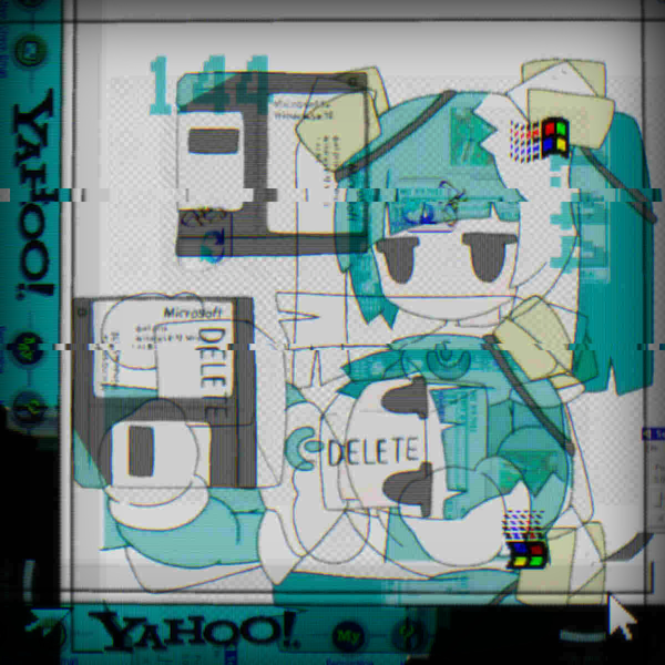
The whole thing began, as these things often do, with a problem that was too small to sound important and too stubborn for me to ignore. I was making a landing page for my website and had originally used an image of Phosphophyllite from Land of the Lustrous. It looked good, almost annoyingly good. Clean. Precise. Thematic. It fit the surface of what I was trying to do, but not the atmosphere underneath it. It had the right shape, but not enough memory in it. It did not feel like it had lived through anything.
So I went back into my archive of wallpapers, which is less a folder and more a graveyard of obsessions, found images, things I had once sworn were “perfect.” Somewhere inside that mess I found 7340543d.jpg , a wallpaper by morizo (morizoshop), and immediately it felt closer to what I wanted. Not because it was already broken, but because it had the right kind of vibe in it. It had a base that could survive being damaged. It felt like the sort of image that could carry scars without collapsing.
That was the real goal: not just to make a wallpaper, but to give it a history.
I cropped it into a 1296×1296 working file and named it input.jpg, which is a very unromantic name for something that would soon go through a ridiculous amount of suffering. From there I started experimenting in the usual way: by trying something that sounded clever, watching it fail. Some attempts were too soft. Some were too synthetic. Some looked like I had just pressed random buttons in image software and hoped the universe would feel sorry for me. A few went so far off the rails that they destroyed the texture I was trying to preserve. Every time that happened, I had to step back and rebuild from the last version that still felt emotionally believable.
The process eventually became a kind of archaeology conducted in reverse. I was not digging up an image from the past; I was manufacturing the impression that it had survived one. The final pipeline looked something like this:
7340543d.jpg → input.jpg → corrupted.jpg → crt.png → tear1.jpg → tear2.jpg → vignette2.jpg → archive_fragment_144.webp
archive_fragment_144:
Here’s a visual comparison of everything this image went through:
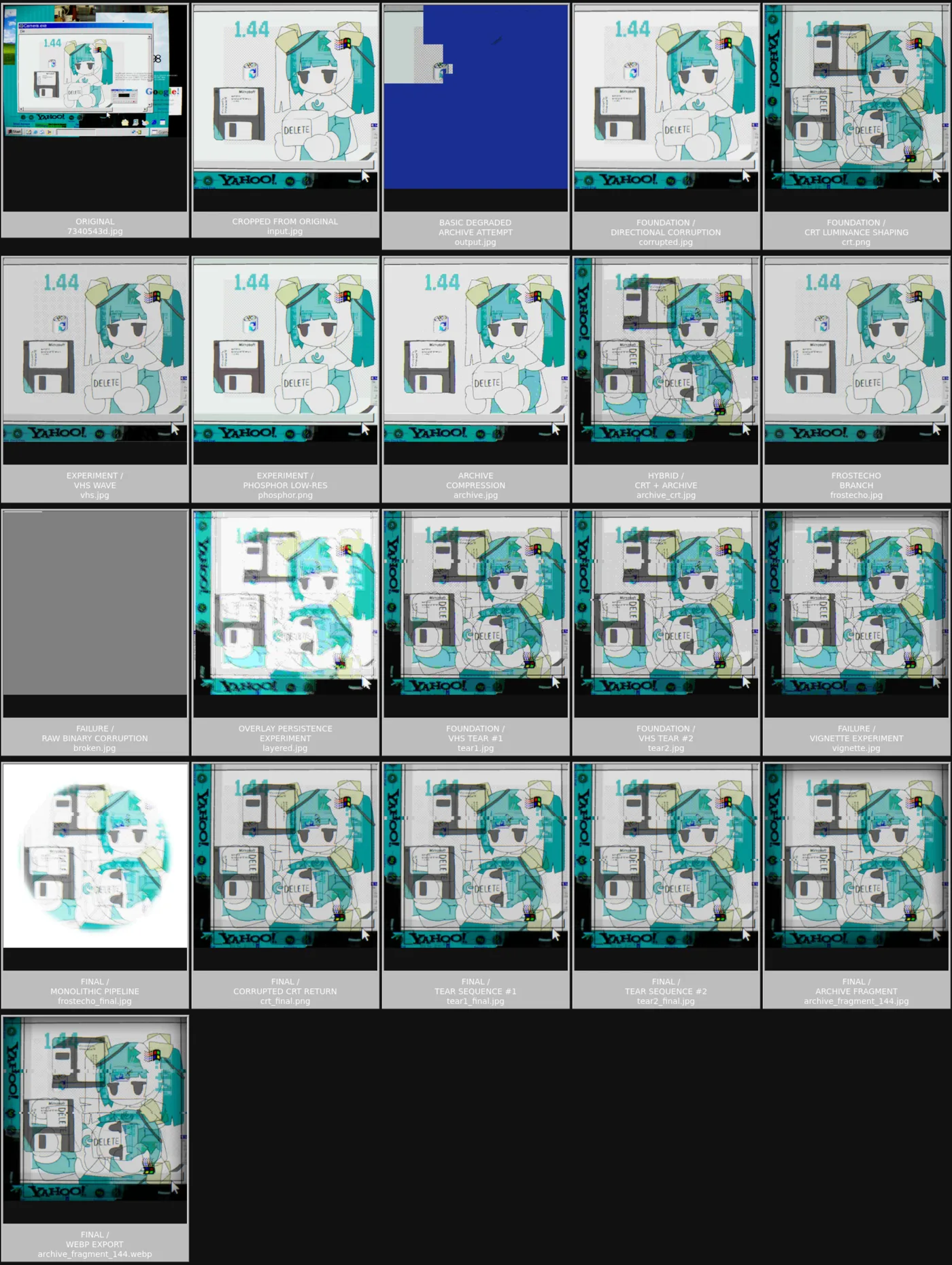
Use the following code to construct archive_fragment_144:
# -1. Download the original high-resolution source image
wget https://cdn.donmai.us/original/23/a1/__original_and_5_more_drawn_by_morizo_morizoshop__23a1daf5056f66a1677ac444e20fa64b.jpg

# -0.5 Rename it to a shorter working filename
mv __original_and_5_more_drawn_by_morizo_morizoshop__23a1daf5056f66a1677ac444e20fa64b.jpg 7340543d.jpg

# 0. Crop a centered square region to create the base working image
magick 7340543d.jpg -crop 1296x1296+300+374 out.jpg

# 1. Generate the primary degraded signal layer:
#    - downscale slightly
#    - apply directional motion blur
#    - inject multiplicative noise
#    - offset red/blue channels for chromatic misalignment
#    - aggressively recompress as low-quality JPEG
magick input.jpg \
  -resize 1200x1200 \
  -motion-blur 0x3+90 \
  -attenuate 0.08 +noise Multiplicative \
  -channel R -roll +2+0 \
  -channel B -roll -2+0 \
  +channel \
  -quality 12 \
  corrupted.jpg

# 2. Simulate CRT luminance falloff using a vertical multiply gradient
#    to darken upper/lower regions and soften the image uniformly
magick corrupted.jpg \
  \( +clone -size 1x4 gradient:black-transparent \
     -rotate 90 \
     -scale 100%x100% \) \
  -compose multiply -composite \
  crt.png

# 3. Introduce the first VHS-style horizontal tracking tear
#    by shifting a thin scanline band sideways
magick crt.png \
  \( +clone -crop 100%x2+0+340 +repage -roll +18+0 \) \
  -geometry +0+340 -compose over -composite \
  tear1.jpg

# 4. Add a second smaller scanline displacement lower in the frame
#    to reinforce analog playback instability
magick tear1.jpg \
  \( +clone -crop 100%x1+0+620 +repage -roll -10+0 \) \
  -geometry +0+620 -compose over -composite \
  tear2.jpg

# 5. Apply a heavy blurred alpha-derived darkening pass
#    creating soft edge collapse / vignette-like signal fading
magick tear2.jpg \
  -background black \
  \( +clone -alpha extract \
     -virtual-pixel black \
     -blur 0x80 \) \
  -compose multiply -composite \
  vignette2.jpg

# 6. Finalize archive export:
#    - rename the processed image
#    - downscale to 600x600 for denser compression
#    - export as lossless WebP using maximum encoder effort
#      to preserve artifact structure while minimizing filesize
mv vignette2.jpg archive_fragment_144.jpg

magick archive_fragment_144.jpg \
  -resize 600x600 \
  -strip \
  -define webp:lossless=true \
  -define webp:method=6 \
  archive_fragment_144.webp
The most convincing decay is not random. It is selective. It preserves enough order for the damage to mean something.
Small Tools, Local Control
The wallpaper matters, but the deeper argument is about the kind of relation a person can still have to the tools they use.
Modern creative software often promises totality. It wants to be the place where everything happens: editing, enhancement, organization, export, synchronization, collaboration, presets, cloud storage, machine assistance, and a polished interface that hides the machinery beneath it. That breadth has practical value. It makes difficult things accessible. It lowers the barrier to entry. It saves time. None of that should be denied. But scale always changes texture. As a tool becomes larger, more integrated, and more predictive, it often becomes harder to feel where the user ends and the system begins.
That loss is subtle. It does not usually appear as a dramatic failure. It appears as a thinning of relation. The user becomes someone who selects, accepts, and confirms rather than someone who handles the object directly. Decisions move upward into menus, defaults, recommendations, and automatic processing. The result may be visually polished, even impressive, but it can feel strangely unclaimed. The image is produced, yet not quite authored. It has been optimized, but the user has not necessarily touched it in any meaningful sense.
Small tools preserve a different kind of relation. They are narrow, local, and intelligible enough that the user can still think through them rather than only around them. They do not try to be everything. They do one thing, or a few related things, and they do them without excessive ceremony. That narrowness is not a limitation in the emotional sense. It is the condition that makes intimacy possible. When a tool is simple enough to understand, it becomes easier to trust. Not because it is perfect, but because its boundaries are visible. The user can see the shape of the intervention. The system is not pretending to disappear.
ImageMagick is valuable for this reason as much as for its technical usefulness. It sits close to the image. It does not ask the user to enter a polished ecosystem of prompts, panels, and abstracted workflows. It gives access to the image as a manipulable surface. The user can blur, compress, remap, layer, crop, tint, and distort with directness. The relationship feels authored rather than assigned. A command-line instruction is not inherently more noble than a graphical interface, but it is often more explicit about causality. One action produces one result. One transformation follows another. The user can still feel the sequence.
That sequence matters because it preserves a sense of agency. Modern software is often designed to reduce cognitive friction, but cognitive friction is not always the enemy.
Some friction is how attention stays awake. Some resistance is how judgment enters the process.
A tool that is too automatic can make the user feel as though they are merely supervising a decision already made elsewhere. A smaller tool asks for participation. It expects the user to understand at least enough to choose intentionally. That requirement is not a burden in the way some interfaces assume. It is a form of respect.
Modern digital systems often hide the cost of convenience. They present smoothness as a free good when it is usually purchased through the removal of texture, the reduction of visible labor, and the abstraction of human choices into defaults. A file opens instantly because the system has decided how it should be handled. A photo looks clean because multiple layers of correction have already been applied. A platform feels easy because the complexity has been displaced somewhere the user no longer has to see. The visible result is convenience. The invisible result is flattening.
That flattening is not only aesthetic. It is political in the small sense that every default is political: it expresses a preference for a certain kind of user relation, a certain kind of output, a certain kind of dependence. The more a system hides its workings, the more it frames the user as a recipient of outcomes rather than a participant in formation. Small tools interrupt that logic because they do not dissolve the process into a seamless surface. They keep the process partially visible. They leave room for the user to feel where the work is happening.
That is why the posts broader ethos aligns so naturally with the editing process itself. A small website, a lightweight page, a minimal asset budget, local control over the feel of the experience—these choices are not just technical preferences. They are part of the same resistance to overdetermined polish. A site that is small by intention is making a claim about what matters: responsiveness over spectacle, presence over excess, form shaped by judgment rather than by platform defaults. The same attitude that prefers fewer bytes, fewer dependencies, and less hidden machinery also prefers images that still show evidence of having been touched.
The connection is not accidental. It is structural. A lightweight site and an intentionally degraded wallpaper share the same moral posture toward digital life. Both reject the assumption that more optimization automatically means more meaning. Both insist that texture can be worth preserving even when it appears inefficient. Both treat restraint not as lack, but as form. The site becomes a place where the user feels the authorial hand, and the wallpaper becomes a continuation of that hand at the level of atmosphere.
That is where the use of small tools begins to look like a kind of resistance, though not in a grand theatrical sense. The resistance is quiet. It is directed against the cultural habit of accepting whatever the system surfaces as the best possible version of an object. It pushes back against the idea that clean output is the natural end of all digital work. It refuses the equation of polish with value. Instead, it asks whether the object still carries enough visible history to feel lived with rather than merely delivered.
That refusal has a cost, but it is a productive one. It means accepting a little less convenience in exchange for a little more authorship. It means allowing the image to retain marks that a larger system might smooth away. It means working with tools that do not automatically translate every desire into a corporate abstraction. In exchange, the user keeps something valuable: a more immediate relation to the thing being made. The result is not just an image. It is an object whose conditions of formation are still partly legible.
That legibility is what makes small tools feel trustworthy. They do not promise total mastery. They do not pretend to eliminate uncertainty. They simply provide a clear path from intention to alteration. In a digital culture that often rewards opacity so long as the results are pleasing, that clarity is a form of integrity. It keeps the hand present. It keeps the user inside the act instead of outside the interface that narrates it.
And once that is understood, the wallpaper stops being trivial. It becomes a concentrated example of a larger choice: whether the digital environment will be left to the defaults of scale, or whether it will still be shaped by local decisions that preserve some trace of human irregularity. The answer is not always dramatic. Often it is just a small command, a small file, a small refusal to let the surface remain perfectly neutral. But that is enough. In digital life, small refusals are often the only way atmosphere survives.
What The Interface Admits
The reason imperfect interfaces feel more human is not that they are rough. It is that they admit what every human-made thing must admit sooner or later: that it was made in time, by someone, under conditions that could not be fully controlled.
Perfect surfaces deny that admission. They present themselves as though they were timeless, as though they had no history, no strain, no hand behind them. They offer clarity, but often at the cost of distance. The viewer sees the result and little else. There is competence in that, and sometimes real beauty, but there is also a kind of silence. Nothing in the surface suggests labor. Nothing suggests revision. Nothing suggests that the object had to pass through a process before arriving here.
This is why even a small mark can matter so much. A slight blur, a compressed edge, a faint chromatic shift, a scanline, a layered duplicate, a trace of ghosting, a wallpaper that looks as though it has been copied one time too many—these are not just defects in the decorative sense. They are evidence. They disclose the fact that the image exists within history rather than outside it. They tell the viewer that the object was handled, reduced, altered, carried forward. And because they do that, they make the surface feel less abstract.
The wallpaper at the center of this post began as something simple, almost anonymous. That simplicity was precisely what made it available to transformation. Once it was processed deliberately, through small and local interventions, it stopped behaving like a generic image and started behaving like an artifact. It did not become valuable because it became more pristine. It became meaningful because it became less obedient to the fantasy of pristine output. Its marks were not decorative additions. They were the visible form of intention. The image now bore evidence of having been thought through.
This is the deeper appeal of small tools and visible edits. They restore a relationship between process and result that larger systems often hide. They keep the user close enough to the object to feel responsible for its atmosphere. They make authorship legible at the level where most digital life is usually most passive. And once that happens, the screen itself changes character. It becomes less like a neutral container for content and more like a place where feeling has been arranged.
That is the argument running underneath the entire process. Memory is compression. History is visible on surfaces. Software defaults are never just defaults; they are values made invisible through convenience. Images are not only products to be consumed, but artifacts carrying the pressure of what has happened to them. A wallpaper that has been intentionally degraded, softened, tinted, and layered does not merely decorate a machine. It gives the machine a climate. It allows the interface to acknowledge that it is not timeless and never was.
That acknowledgment is what makes the result feel alive. Not because it is messy, but because it is honest about limitation. A perfect screen can feel remote because it tries to erase the evidence of its own making. A marked screen feels closer because it leaves some trace of the human hand visible in the surface. It does not pretend to be untouched. It does not pretend to be eternal. It carries the evidence of use.
That may be the most durable form of emotional legibility in digital space: not immaculate surfaces, but surfaces that still remember they were handled.
A screen feels alive when it stops pretending to be timeless.